As a juggler and a designer, it’s only natural that those two passions merge from time to time. And while I enjoy creating juggling-based designs for my own purposes (I’m launching new items soon with Joculare), over the past few years I’ve been given opportunities to create logos for various juggling clubs and juggling festivals. I’m featuring those designs below.
If you’re a juggler who found this page and are in need of a logo for your group or event, please feel free to contact me.
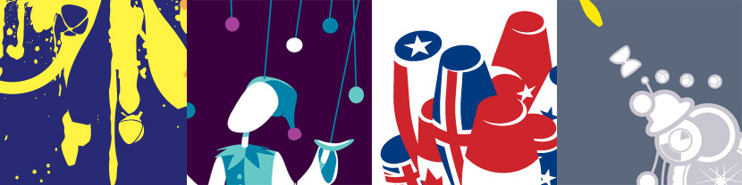
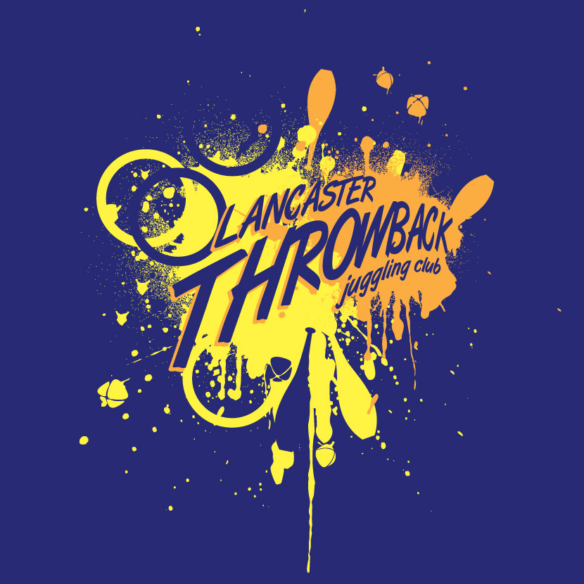
Lancaster Throwback Juggling Club Logo (2010)
This is the juggling club I attend. We’re talking Lancaster, Pennsylvania here—not Lancaster, UK. We’re a small club. It’s a rare occasion when we exceed ten people at one of our bimonthly meetings. And as an organization we’re very informal. After one meeting we walked two blocks to a coffeeshop, where we decided our club needed a name. Lancaster is famous for its Amish residents, but we didn’t want a straightforward reference to that as it’s so cliché. Instead we gave a nod to our county’s reputation by going with “Throwback” as the name. Plus, when two or more people juggle together, it’s all about throwing back. We had a name! We were officially the Lancaster Throwback Juggling Club. Now we just needed a logo, and that task was assigned to me. Again, I wanted to avoid an Amish reference. Instead I went with the concept of throwing back and went with a splatter look that integrated the shapes of various juggling props into the splatter. Below is the final result.
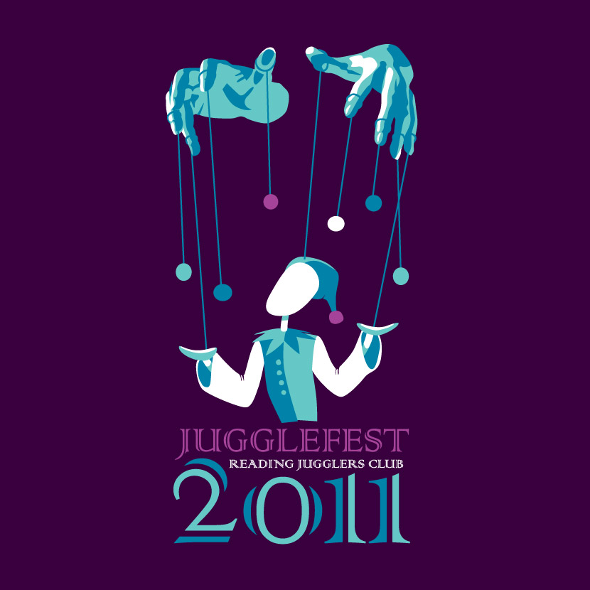
Reading Juggling Club Jugglefest Logo (2011)
A year later the Reading Juggling Club (Reading, PA, not Reading, UK) held a logo contest for their annual juggling festival which took place at Kutztown University. This club holds a special place in my heart as I attended there sporadically throughout my high school years as my love for juggling developed. They’ve maintained a dedicated core group throughout the years and always put on a great festival. I decided to enter the contest that year and won. The logo played off the jester-style character they use in their club logo, but turns it into a marionette. I love this logo. My only regret is the hands. Looking at it with fresh eyes, the style doesn’t quite fit the rest of the logo. And sadly, while the Reading Juggling Club is still active, 2011 was the final year for this festival. I’m hoping they’re able to bring it back one of these years!
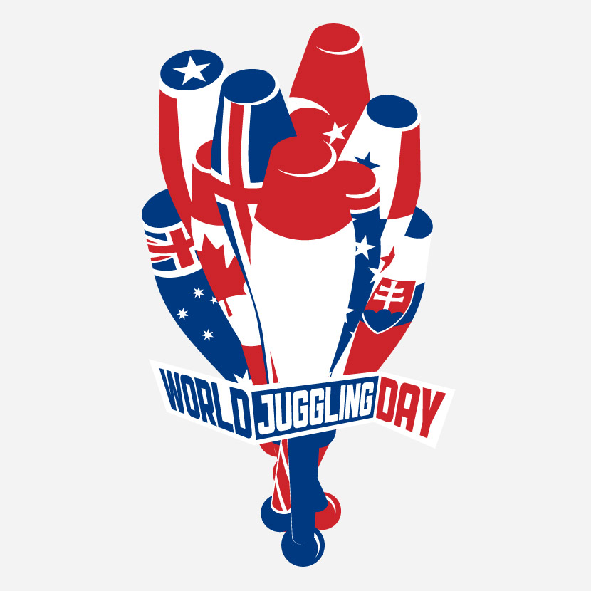
World Juggling Day Logo (2012/2013)
World Juggling Day takes place every June. For the Throwback club, it’s been a fun way to interact with and promote juggling to the local community. In 2012 the International Jugglers’ Association (IJA) held a logo contest for that year’s upcoming World Juggling Day. Challenge accepted. And challenge lost. There were quite a few entries from across the globe. And while I feel mine was one of the top three, the winner was chosen via votes on Facebook and I simply didn’t have the numbers. But the following year the IJA contacted me and asked if they could use my submission from the previous year as their logo for 2013. Absolutely! The design represented the international aspect of the organization by wrapping various flag designs around juggling clubs. I was limited to two colors, so I selected two colors commonly used in country flags: red and blue. I then selected flags that only use red, blue, and white. The design was used in promotions, on social media, and slapped on t-shirts.
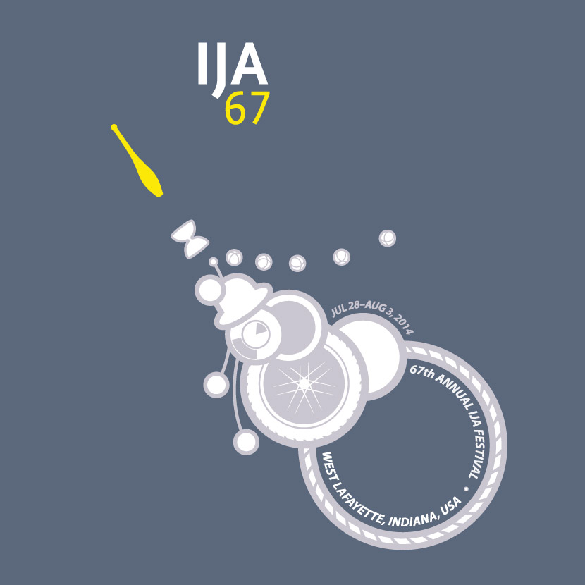
International Jugglers’ Association Festival Logo (2014)
That brings us to the current year, and this year the annual International Jugglers’ Association festival was held in West Lafayette, Indiana. Due to the successful World Juggling Day logo, they asked me to design a logo for their festival. This was used on t-shirts and other materials. I had planned on attending this festival for my first time, but it had to be axed from my schedule due to other responsibilities. One of these years I’ll get there. One big goal with this logo (as is my goal with all juggling-based artwork) was to avoid being cheesy. Most juggling artwork is pretty rough. I wanted to keep it clean. And I went with a rocket motif—the yellow club representing the rocket. The other gray and white props formed the billowing exhaust from the rocket. Plus they wanted the design to partially wrap around one side of the shirt—hence the offset nature of this logo.
If you like my work and are a fan of juggling, keep an eye on Joculare’s Facebook page or Joculare’s Twitter feed where I’ll be announcing new designs for sale very soon.