About William Everhart
A hoopnologist of hoopnotic hoopnotism—that was the description given to William Everhart of Ohio, often credited with originating hoop rolling. The turn of the century saw him take hoops to artistic and technical heights never before seen. Learning to juggle as a blacksmith and experimenting with wheels at a buggy factory, he soon performed with traveling shows, focusing more and more on his hoops. Dubbed “The Great Everhart,” it wasn’t long before he was headlining, sending hoops up and over his body, though other hoops, along raised strings and across stages of theaters around the world.

About the Design
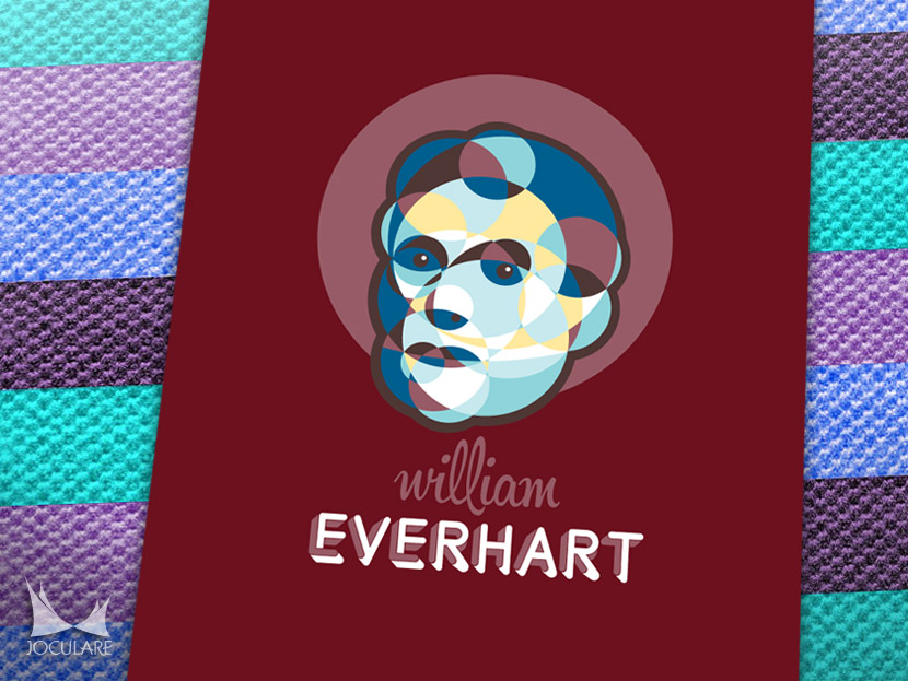
William Everhart was all about hoops. Many hoops. We’re not talking hula hoops here. Think bicycle rims where the edges have an inward-facing arch. My goal was to show quantity. But I didn’t necessary need to show one of Everhart’s patterns in action. I’m trying to capture the spirit of the artists with this series. The challenge was showing multiple hoops in a cohesive, beautiful arrangement, while not showing his act in progress.
Another self-imposed requirement of this series was to include the performer’s head or face in the design—and there was my answer. I simplified the hoops by making them solid circles. I started overlapping and arranging them using varying sizes. The contours of the larger circles and the intersecting points matched up with the features and shadow lines of William Everhart’s face.
When the circle positions were finalized, the overlapping segments were made into separate shapes within Illustrator. A palette of six colors was chosen and assigned to each segment. Darker colors were generally assigned to the hair and features, though they were broken up with lighter segments in order to provide contrast. And I was careful that no touching segments were the same color. I was very pleased with the result. Not only is it an attractive design, but it does look like Everhart.
In an earlier version of this poster I included renderings of six hoops below the artist’s face. These were eventually eliminated as they seemed too forced and did not fit with the rest of the design. The face design is so distinct and intricate that it would be difficult to integrate another element. So as is true in most cases, I decided that simple, bold, and uncluttered would be best.
The font used for last name is Bron Black. It includes rounded ends both in the main face and in the shadow portions. The rounding with the resulting swirl effect made it a great choice for the spirit and feel of this design.
A slightly-altered Hipster Script Pro was used for the first name. Using a script helped break up the very uniform nature of the elements used in the face and last name. But I used a color with low contrast so that it wouldn’t cause clutter or bring unneeded attention.
You can purchase this poster or select from many other juggling designs at joculare.com.


