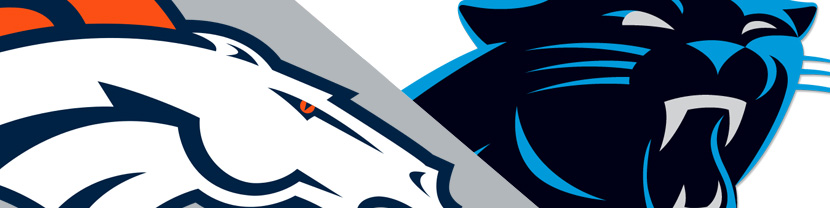
This is my second time officiating a logo battle for the big game. In 2015 we had a pretty clear victor when the logo of the Seattle Seahawks took on the logo of the New England Patriots. This year it was the Denver Broncos versus the Carolina Panthers. The logos for both teams are rather solid and very modern. Take a look at the two logos below and decide which one you think is best before continuing with your read.
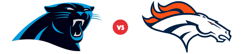
Carolina Panthers Logo
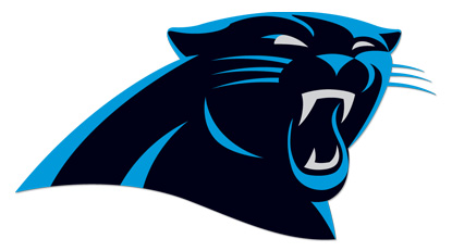
With a relatively brief history, the Carolina Panthers were formed in 1995. And apart from a modernization in 2012, the logo has remained unchanged. The logo is distinct in that it is primarily black. This could be said of the Raiders as well, though their black is primarily in the background. With the Panthers, the main character of the logo is pure black. And I admire that about this logo. That’s a risky move, and it does cause complications when it comes to integration. But looking at it’s use in the logo itself, it’s a great element.
In researching this logo, I read quite a bit of high praise. And while it is a solid logo, I feel the praise is a bit over the top as there are a few problems with this logo. For starters, there is very little movement. The beast is letting out a rather hefty growl, but the beast also appears to be sitting down. So while the eyes and the fangs exude fierceness, the lack of visual movement is a bit anticlimactic.
Let’s now consider the 2012 redesign (which you can read about here). Basically what they did is “Starbucks” the logo. What I mean by that is they simplified the logo design by eliminating the borders. Was this a good move? Yes—but only because their previous integration of borders was poor. Looking at their original logo, it had a fairly thick blue border and that entire thing then had a relatively thin outer black border. And that border was simply too thin.
So while losing the border did simplify the design, it also introduced complications. This is where the black color comes into play. In order to add definition to this very black logo, facial elements and borders were formed using the brighter blue. You’re left with a logo that is bordered by a mid-tone color on almost all of the edging except for the bottom. What’s the result? Consider the scenarios:
- When placed on a white background or a light color (like the silver of their helmets), the logo looks fantastic.
- When placed on a black background, the black of the logo combines with the background and you’re left with a logo defined by some blue lines. It still looks pretty good, though it loses a lot of its punch.
- When placed on a blue background (the same blue that’s used in the logo), you lose the upper definition of the panther. The right half of the logo still works as there are enough elements to suggest the actual border, but the left-hand ear area looks off.
- When placed on any other background color, it’s going to look bad. Since blue is a mid-tone color, there’s going to be very little contrast between the background and the logo’s edging.
These may seem like minor issues but for a logo that was created to work well in digital media, these issues are significant. Visit the NFL’s website and look at the lineup of logos across the top black bar. Which one gets lost the most? It’s easily the logo of the Carolina Panthers.
Despite my nitpicking (which is the point of this website), the logo is not bad. The colors themselves are great, and the logo is used well on the outfits. My overall problem is that it seems the primary goal in designing the logo was to create a cool-looking panther, and not much more. The lack of movement, lack of cohesive elements, and troublesome integration prevent me from labeling this a “great” logo.
Denver Broncos Logo
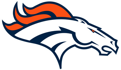
Now let’s move on to the logo of the Denver Broncos. Start by taking a look at the history of this logo and appreciate how far it has come!
Another great read is the story of how the latest Broncos logo was developed, where we learn that it was designed by Nike. The owner of the Broncos, Pat Bowlen, wanted an equivalent of Nike’s swoosh. And in the end the design team “emphasized the flow of the power through the neck.”
And indeed the neck shape and the inner neck lines are integral. In fact almost every line of the horse is pushing forward. This horse is moving—and moving full tilt. The one primary break in the motion-filled lines is the bow of the jaw line. Yet that jaw adds strength as it has the feel of a muscle. In fact the whole horse’s head feels muscular.
The lines are bold, most of them slowly tapering to a point. The one line that isn’t bold is the eye socket, but that allows the orange eye to remain piercing as the socket does not drown it out.
The design of the head and neck is incredibly solid. Yet the most intriguing aspect of this logo is the mane. If you’re like me, the mane is the last thing you looked at, despite it’s brighter color and flowing nature. To make the flying mane an afterthought is quite the accomplishment. Notice that not a hair of it is hanging down. It adds to the feeling of intense motion by flowing straight back and slightly up. It also acts like flames, as if shooting out the back of a fast race car.
The Verdict
If you’ve read this far, you already know that I’ve crowned the Broncos as victors in this logo battle, just as they won on the field. Disagree? I’d love to read your thoughts—but please restrict your comments to the topic of design!