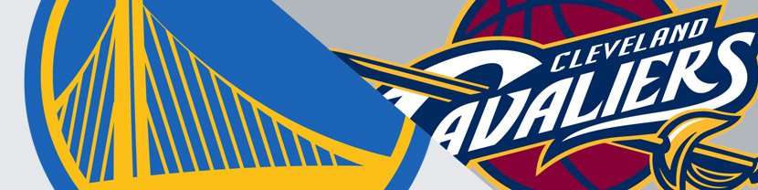
It’s time for another battle of the sports logos. We’ve already looked at football and hockey. And now that we’re in the midst of the NBA Finals, it’s time for basketball. The 2015 finalists are the Golden State Warriors and the Cleveland Cavaliers, and their logos could hardly be more different in style.

Golden State Warriors Logo
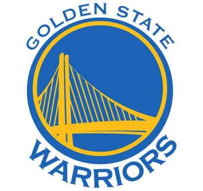
We’ll start by looking at the logo of the Golden State Warriors. And what we have is a bit of a throwback logo. Their original 1962 logo features an indian headdress, but the logo they’re throwing back to is their second logo of 1969 which features the San Francisco-Oakland Bay Bridge. However this is not a quick, temporary throwback as 2015 marks their fifth year of using this logo. And using it was quite the bold move given the very modern logo this one replaced.
As someone who has no interest in basketball, I was not familiar with the logo of either challenger. And frankly, my gut reaction to the Golden State Warriors logo was very negative. It feels like it belongs to a high school team. But the more I study it, the more I find and understand some redeeming qualities. My favorite quality is how the curves of the two span supports plus the main upright form the general shape of the lines on a basketball. In looking at an overview of NBA logos, my general complaint is how many simply throw a basketball in their logo’s background. That can be done well, but the way the Golden State Warriors show a basketball without showing a basketball is slick. Plus they do it using a landmark of their state. The bridge itself is nicely styled.
But there are complaints. I understand there is a throwback nature to this logo, but does it have to feel this drab? The colors pose a big problem. There’s a medium yellow against a mid-tone blue. This provides little contrast, resulting in a muddy logo rather than one that pops.
And despite the nice graphic design job on the bridge, you’re left with—a graphic design job of a bridge. It’s lacking in fun. And as I mentioned in past posts, sports are fun (or so I’m told).
Then there’s the white space. What to make of that white space? I’m not anti-white space. I’m very much for it. And in this logo it plays very well into the basketball shape that’s insinuated. But here’s the problem—the white space is the most eye-catching part of the logo. When that happens, you have a problem.
But the biggest problem is the choice of font. I’m sure having a wide font was important. I would agree with that. But they chose Copperplate, which is a very standard font that has been overused for decades, usually by banks and lawyers. And that’s the biggest offender in making this feel like a high school team logo. Yes, the logo succeeds in providing a throwback feel. But I have to imagine the team’s goals for the logo go beyond that.
Cleveland Cavaliers Logo
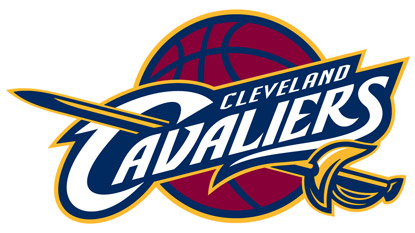
The contender is the logo of the Cleveland Cavaliers. Here we encounter a classic 2015 sports logo. It has the italicized sans-serif text with pointy ends thrown in, and it has the team name framed by a background color which is then outlined itself.
It has great contrast, and uses contrast to layer the logo, making sure the most important elements are seen first. The white on dark blue team name has the most contrast and it pops. The yellow and dark blue sword is second in line with contrast. Bringing up the rear is the background basketball which has almost no contrast via the mid-tone red and dark blue. These levels of contrast add depth to the logo. Plus there are other subtle features, like the curves in the handle and butt of the sword coordinating with the curves of the R, S and other letters.
Earlier I complained about basketballs being thrown into the backgrounds of logos. That’s easy to criticize, but it’s hard to say it’s rarely appropriate. I think in this case it works just fine—the implementation is well done. It’s a strong logo that is at the same time very safe. We’re sticking to the trends of the day. In that respect it’s not the most creative of logos. But it’s well designed, eye catching, and very strong.
The Verdict
No big surprise that I’m naming the Cavaliers logo as the winner. I wanted to like the Golden State logo more. And indeed, it did grow on me. But that lack of contrast docked a lot of points, plus there was no getting around the font choice.