Earlier this week Super Bowl XLIX was contested, and what a contest it was! Even for someone like me who isn’t a huge football nut, that was an exciting few hours. But as exciting as it was, I started looking at the game from a design point of view.
I’ve watched the Seahawks play a few games this season and every time I’m struck by their dark outfits with the pops of brilliant green. They just look tough. When they played Green Bay, who wore cheerful yellows, bright whites and green stripes, I thought to myself that Seattle’s outfits must be giving them some kind of mental edge. So I decided to look up images from the past 48 Super Bowls and chart the winners based on whose outfit was darker.
And according to my very informal survey, it makes no difference at all. The results were split right down the middle. If outfits do have any effect, it’s not enough to sway many games.
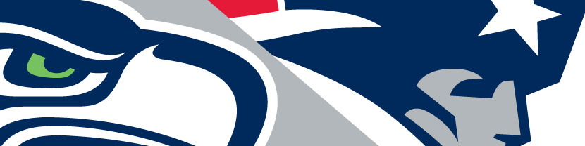
So instead I decided to have a team logo face off. Let’s analyze both team logos and see who comes out victorious with the better logo. Take a look at the two logos below and decide which one you think is best.
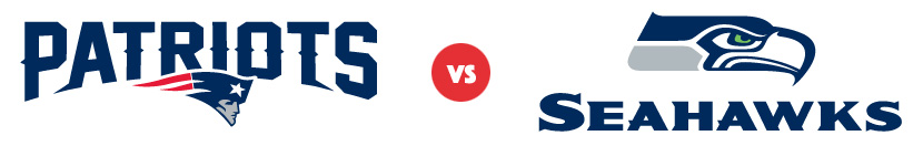
The winner? It’s the New England Patriots once again. “What? Just like that? You’re not going to go on and on analyzing each logo before declaring the winner?” Oh, don’t worry. I’m going to drone on and on. But the winner is immediately obvious. The strength of a logo is communicated almost instantaneously. The question we’re going to overanalyze, and which will help us in our own design efforts, is this: what makes the Patriots logo better?
First, it’s important to understand the background behind each of these logos. They both have fascinating stories which I won’t get into here. You can read about the Seahawks logo’s Northwest Coast Indian art influence via a blog post by the Burke Museum. And you can read about the Patriots logo’s 1993 redesign and its ill-fated 1979 predecessor via Paul Lukas’ commentary on ESPN.
Seattle Seahawks Logo
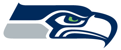
Let me start by stating I do like this logo. And now having a basic understanding of its history, and its roots in the art of the northwest, I appreciate it all the more. It is solid and balanced. I like the slight upturn at the top left to balance the downward angled point of the beak. And the restrained used in the pop of green makes it all the more effective.
The main concept behind this logo has remained unchanged since its inception in 1976. There was a significant streamlining that took place in 2002 which modernized the eye, updated the colors, and lengthened the two stripes to the left of the eye while angling the left-hand edge (among other subtler tweaks). Whether that continuity is of value or not, the reality is that we’re left with a slightly-outdated style. Though it has plenty of horizontal movement, overall it’s a bit static with a rather rectangular shape. It’s a bit of a brick. And while I appreciate variety within the styles of the NFL teams’ logos, this one is lacking the dynamic feel that the majority of the other logos possess.
Also giving it an outdated feel is that eye. Thankfully they changed the original eye design which was almost a direct copy of the tribal mask from which the logo was inspired. But it comes off as being a bit cartoony. I think the Seahawks logo, as well as the logos for the Eagles and Ravens, could improve from stylizing the eye a bit more. The Falcons, and even the Patriots themselves, take an obscured/stylized eye approach and it works well.
Finally, my biggest criticism comes from the integration of the Seahawks name with the logo. The font face itself feels a bit dated, though it does match the style of the logo well. However when you consider placement, it just doesn’t gel with the mark. And part of the challenge there is that the logo mark is a brick. It’s difficult to have the two pieces gel. So what they’ve done is straightforward and fine, but as this is a competition, I would say this is where the Seahawks logo falls behind New England’s by the widest margin.
New England Patriots Logo
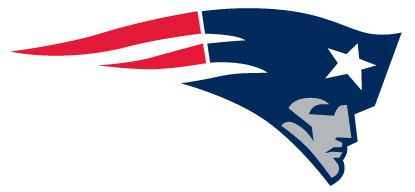
As we ended the previous section talking about type, let’s start there with the logo for the New England Patriots. Here we see the logo mark and the type merged brilliantly. The upper curve of the logo was used as a springboard for curving the bottom of the type. But it’s much more than that. Why is the type so much larger than the mark? One of the two had to take the lead, otherwise the two would compete. But as the type is significantly larger than the mark, the mark slightly overlaps the bottom of the text to give it visual weight despite its size.
Next, notice the two lower offshoots of the “A” and the second “T” which shoot left and right. These do four things:
- They create movement.
- They take advantage of the natural white space created by the shapes of the letters.
- They frame the text, creating a sort of underline without actually using an intrusive underline.
- They mimic the left-most point of the logo mark and to a lesser degree, the right-most point as well.
And one more comment about the text. Note the points added to the mid section of many of the letters. Not only does this add horizontal movement, but in doing so it makes the letters look wider than they are, thus allowing them to jive better with this very horizontal logo. And equally important, they keep the aforementioned footer arrows from looking out of place.
The beauty of the mark itself is that it’s able to put a very fresh spin on a theme that is used a lot—the American flag. The flag shape creates movement—and not just horizontal movement, but a slight arc as that of a thrown football. The white and red stripes of the flag are cleverly morphed into motion trails. Plus the entire flag portion doubles as a hat. It’s very difficult to merge three concepts into a single image (motion, flag, hat), but here we see it executed to perfection. The face itself is a work of craftsmanship, with the point of the chin balanced by the tip of the hat.
The Verdict
While I crown New England as the clear victor in this battle, I’d love to hear your take in the comments section. (Please restrict your comments to the topic of design!) And with both of these teams, it was gratifying to see the history of the cities, states, and regions in which they are based expressed and honored through the design of their logos.

I enjoyed this and learned from it. Please more of these. Atlanta Hawks vs Golden State Warrriors (two best records in NBA, playing each other Feb 6, both reintroducing classic logos recently.
Thanks, Nick! I enjoyed doing this comparison, and would love to not wait until the next Super Bowl to do another one. Will check into those teams.
Really interesting. Both logos utilizing same colors almost but the “Patriots” does have a more appealing flow even though they are both great logos. However I beginning to wonder what if the eagles head was on the right side of the letters after “Seahawks”‘. There will also be a red underline style under the word “Seahawks”. I guess it would look better. Color and weight of the logo is really important even for website design.