It happens. From time to time a project goes down in flames. I’ve gotten better at sniffing out the jobs that are going to be troublemakers, but sometimes they catch you by surprise. Unfortunately, they’re usually ones I put a lot of work and time into. So I decided that rather than relegate the work to the dusty archive bin, why not feature my rejections in all their glorious shortcomings.
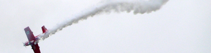
A few years back I took on the task of developing a logo for a company that offers flight training, charter services, and aircraft rentals. It was a fun project. But after the first couple proposals were rejected, it was revealed they wanted to feature the image of a plane without showing a specific type of plane—you’ll see my attempts at designed obscurity below. Long story short, in the end none were selected. Looking back, most of the logo designs were overdone in an attempt to get a bite on a direction they liked. That never happened.
I do have some rules I follow pretty strictly when it comes to design. One is that I always design logos in black and white first. You’ll see that reflected here.
![]()
![]()
![]()
![]()
![]()
![]()
![]()