
Between my wife and me, we have a number of small businesses and ventures. And as a graphic designer and web developer, I’m able to promote these ventures effectively while spending little money. It’s very convenient. But when it comes to photography, the results are always lacking. We’ve both had training in photography, but we simply don’t have the equipment. What I do have is decades of Photoshop experience.
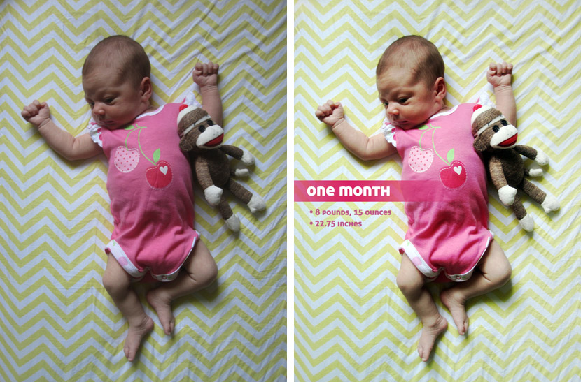
Don’t be fooled! There is no replacement for good photography. No amount of Photoshop work is going to make your photo as good as it could have been if shot in a professional manner. But professional-level photography is rarely an option. Last week my daughter turned one month old. And as someone who loves to document milestones, I plan on producing a quality image to highlight each month of her first year. Using my experience with the first month’s photo as an example, below I present some tips for both executing and editing the photo. This is aimed at beginners who, like me, are using a fairly basic camera without an aperture control (f-stop).
Taking the Photograph
- Do not use a flash. There are times to use a flash, but they are few and far between. I haven’t used the flash on my camera for years. A dark photo is much easier to correct than one with the harsh light and shadows created by a flash. For professional-looking photos, you want to make sure you have sufficient light so that a flash is not necessary.
- Use a tripod. This is especially true when taking photos indoors where light is not always plentiful. Your shutter will remain open longer to allow more light in. That longer time allows more of a chance for a blurry photo. (Confession: I did not use a tripod for my shot as I was in a hurry due to the temperamental nature of babies. The sharpness of my photo did suffer as a result.)
- Use natural, dispersed light. Unless you’re investing in multiple quality lights, your best route is to use the light of the sun. Wait for an overcast day when at all possible. Direct sunlight and the shadows it creates are too harsh. Even the light of a cloudy day can be too much. Try shooting indoors near a window where direct rays are not streaming in.
- Consider shadow placement. Again, unless you’re using multiple light sources, shadows are going to be a reality. When taking my daughter’s photo, I had her head pointing to the window, keeping the shadows at her feet and at the bottom of the image where they would not be distracting.
Editing the Photograph
 Adjust levels. A quality photo will include a full range of tones from white to black. In Photoshop, open the Levels dialog box (Image > Adjustments > Levels). The graph you see under “Input Levels” represents your range of tones. If the graph doesn’t extend all the way to the left, your darks are not as dark as they could be. Click and drag the black arrow below the graph to the right until it meets up with the start of the graph. Similarly, pull the white arrow to the left until it meets up with the end of the graph, to ensure your brightest whites are fully white. Photoshop offers a shortcut called Auto Tone that does the same thing (Image > Auto Tone), but I encourage you to do it manually until you truly understand what you’re doing.
 Adjust curves. Curves are similar to Levels. I use Levels to adjust the tone range and I use Curves (Image > Adjustments > Curves) to adjust midrange tones. I won’t go into too much detail here. You’ll see a diagonal line. Click on the middle of the line and drag it while watching the effect it has on your image (be sure the “Preview” box is checked). Most images will require only a subtle move of the line. And while you can customize the line via more than one point, you rarely need to do so.
 Add contrast. I find most of my photos can use a bit more contrast (Image > Adjustments > Brightness/Contrast). Be careful. The more contrast you add, the more detail you loose in your lights and your darks. Don’t go overboard here. Evaluate the focal points of your image.
 Adjust areas of focus individually. Photoshop’s Quick Mask feature is a beautiful thing. It allows you to “paint” a selection shape just as if you were adding color to your canvas. I’ll create a gradient-based selection when half of my image is overly dark or light. That allows me to adjust one side without any noticeable transition lines. When the subject of my photo is a person, I’ll often select the facial features using a soft-edged brush and then use Levels, Curves, and/or Contrast to tweak that focal point area. (I’ll often do the same for hands.) Toggle between Quick Mask Mode and Standard Mode by pressing the Q button.
 Filter sparingly. Thanks to Instagram, many people are familiar with the concept of filters. There are a number of ways to apply filters via Photoshop. There’s even a top-level menu item titled “Filters.” You can also apply a Layer Effect to any of your layers via a drop-down menu at the top of the Layers palette. Think subtle. Those new to Photoshop are often enamored by all of the filtering options and end up going overboard. Stick with your original goal for the image and don’t get sidetracked by a gaudy filter or effect.
 Use effects tactfully. In Photoshop, layers are your friends. And they allow you to implement filters and effects in subtle ways. In my sample project, I duplicated my main photo layer and blurred it using the Unsharp Mask filter. I then assigned that layer a Color Dodge effect. I was left with a blown out, blurred copy of the main image. But I then set the layer opacity to 20%. The result is an image with some funky, subtle contrast applied (thanks to the layer effect) and a very subtle halo glow on the image edges (thanks to the blurring filter). The key is being both tactful and tasteful.
Designing the Photograph
Finally, a quick note about design as that’s the focus of this site. Always make any headlines or other copy feel as if they belong to the rest of the piece. I integrated the left-hand text by making the main header bar extends over the baby’s middle and using a color similar to her outfit. Plus the baby is looking down at the text. So I’m using color, position and visual movement to make the text a true part of the image.
This has been a broad overview of how to shoot and edit a less-than-perfect image. Do you have any favorite methods or tips you’d like to share? Please leave a comment!


LOVE THIS! Thanks. Your blog is great.
I love side window lighting for portraits of people, animals and even flowers in a vase. I also love strong side lighting through blinds. As much as I love Photoshop, I also love the free Picasa for the “Darken Shadows” and easy photo straightening grid feature.
Hi,
Many many thanks for sharing such a great editing tricks. Really outstanding and I am really impressed by your works. I personally I use the desktop version of Photoshop all the time for work all the time and have been using it for years and it is the best. I recently tried out the express version on my phone because I was curious and it is almost as good.
do you have a complete tutorial how to use adobe photoshop software
No, I don’t. There are plenty of great Photoshop tutorials available on line, but none on this site.