Let me reiterate that these articles on logo design are targeting those with very little knowledge about logos and especially design. So we’re going to look at some basics and answer a common question of beginners: what software program should I use to create a logo? To answer that, let’s first look at the two fundamental types of digital images: bitmaps and vectors.
The concept of bitmap images is fairly straightforward. Imagine a grid of dots. Each individual dot can be a different color. Now imagine there are thousands (or millions) of dots that make up this grid and each dot is very small. The combination of colored dots forms the appearance of an image. This is the essence of a bitmap image.
So how many individual dots will be used in my logo? It depends how you’re going to use the logo. This is where things can get confusing. Stick with me as I’m going to make this as simple as possible. As we look at the number of dots that make up an image, we’re referring to resolution. An image that’s made up of many dots (high resolution) will be crisper than an image that uses few dots (low resolution). In the same way, a high resolution image file will take up more disk space than a low resolution image file. That’s only natural as the high resolution file will need to store the color data for a greater number of dots.
Let’s get practical. Your logo is going to appear at the top of company letterhead. Its printed width will be three inches and it’s height will be one inch. The standard recommended resolution when having something printed commercial is 300 dpi. The dpi stands for “dots per inch.” This is something you can easily set up via any decent image editing program, and doing so is beyond the scope of this post. But let’s run with this example to understand the problem with bitmaps.
You have your 300 dpi image ready to go. It looks great. You get your letterhead printed. It also looks great. Now you want to use that same logo on a business card and that means it needs to be smaller. No problem. You can either size the image down in your image editing program, or size it down via your page layout program. As the image is reduced in size, you end up with more color information than you actually need. But that’s OK. It will print just fine.
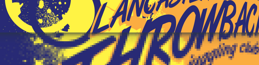
However, you also want to print the logo on a vinyl sticker for the side of the company car, which means it needs to be enlarged to 24 inches wide. Is this a problem? Absolutely! Just like shrinking a bitmap image gives you more color information than you need, enlarging it leaves you with less than you desire. Think of it as each individual point taking up more and more physical space. The space that used to be made up of nine dots is now represented by one. You’ve lost detail. The end result is that your image is no longer crisp. It’s starting to get blurry. You may have seen countless crime scene shows where a tiny section from a surveillance camera image is “enhanced” to the point that you can now see crisp detail. Sorry. It’s not possible in those scenarios and it won’t be possible with your bitmap image. And that is why rule number two for logo design is as follows:
Avoid resolution issues by creating vector-based logos.
So how do vectors differ from bitmaps? Vectors do not store information as grids of dots. With a vector-based image, each element of your design is stored as a mathematical formula. You create lines and curves. You add type. Each element can have a border color and a border style. Most elements can be filled with a color, or a gradient, or a pattern. But remember that each element, border and fill is stored as a mathematical equation. And this is significant as it means your logo can now be printed at any size. As your image is enlarged or reduced in physical size, math does the job of scaling each element proportionally. Whether you’re using it on a business card, on a billboard or on the side of a skyscraper, you will not lose any crispness. It is “resolution independent.” It’s not tied down to a set number of “dots per inch.”
What does this mean? Does your logo have to be vector based? Absolutely not! The reality is that software for editing vector images is much less common than software for editing bitmap images, and it has a steeper learning curve. When it comes to bitmaps, Adobe Photoshop is king of the hill. But even a basic editor like Microsoft Paint can handle the basics and beyond. Your budget is a reality and if bitmaps are your only option, you can create your logo as a bitmap. The key is to remember that you will not be able to enlarge your image without losing clarity. So create your logo at the largest size that it will be used. You can always scale it down for smaller uses.
However, if you have the resources and are willing to learn a slightly different set of editing tools, vectors are almost always the preferred solution. Adobe Illustrator and Corel Draw are two of the most popular software solutions, but there are plenty of cheaper alternatives.
As an aside, you may be wondering if there are any other digital image formats apart from bitmaps and vectors. Yes, there are! With the rapid, non-stop advancements in technology, my guess is that there are quite a few obscure formats I’m not familiar with. One that has been around for quite a few years is a fractal-based format. While it has gained some steam it’s still something you’re not likely to encounter. Like vector images, they too are resolution independent. Unlike vector images, you start out with a bitmap image, which you then save into fractal format. At that point the image becomes mathematically encoded as an algorithm and…wait. This is fascinating but let’s get back on track!
You’ve decided between bitmap and vector, and you have the necessary software to begin logo development. (Right?) Great! Now it’s time to start thinking about the logo design itself. And that’s where we’ll be going in the third article.