
About five years ago I developed a plan. As both a professional juggler and an artist, I noticed that the few pieces of juggling-based artwork I came across were either pretty cheesy, pretty lousy, or both. Occasionally someone offers a well-designed t-shirt, but in order to find that you need wade through a sea of rough illustrations, inside jokes, and bad “ball” puns.
Jugglers seem to like that kind of stuff and that’s fine. But at the same time, I think many would appreciate something beyond the jokes. And so I decided to make a line of juggling-based designs that were solid and classy, while not losing all aspects of fun.
I started out with what I’ve titled my “Innovator Series.” These are designs featuring innovative jugglers from throughout the 20th century. I quickly developed the first five posters in the series, created a website and had a soft launch for the brand. And then things stalled. Life happened, my family grew, and my plans kept getting pushed back. But the dream was still in my head.
I am now finally in the process of doing a full launch of the brand. Initially it will still focus on the Innovator Series posters, but other products and themes are not far behind. Over the coming months I will be featuring many of these designs on this site, but I first want to feature the logo for the brand, which I’ve named Joculare.
When it comes to logos, as much as I appreciate the very illustrative types that are so popular today, I still lean toward the simple shapes. And I wanted to avoid anything too representative, because when it comes to juggling, what can you represent other than clubs, balls, and rings? And those have been way overdone. So the inspiration for my shape was the paths created by a basic three-ball juggling pattern.
![]()
Initially the logo had just the two foreground triangular shapes. But upon looking at it with fresh eyes the next day, I realized it looked like a bikini top—and that’s not what I’m going for. So I decided to add the background triangular shapes as well, representing a changing pattern and simply making the entire shape more interesting and engaging. I was very happy with where I landed, and the logo hasn’t changed since then.
But as the shape is abstracted, I started seeing other things going on in this logo. And as the artwork created for Joculare will go beyond juggling and into the fields of clowning and the circus, I created three variations of the logo which represent the three main focuses. I’m not exactly sure how these variations will be used, but they all strictly adhere to the shape of the main logo.
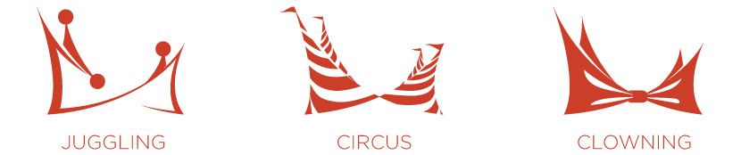
The first variation takes the juggling pattern theme and makes it more obvious in order to represent juggling. The second variation takes the four triangles and turns them into a cluster of circus tents, representing the theme of the circus. And the third variation converts the logo into a somewhat exaggerated and oversized bow tie, thus representing the world of clowning.
This logo has inspired me to branch out from my initial “juggling-only” focus. As my wife is a professional clown and as we’re both ambassadors for the world of clowns (who have gotten a bad rap due to Stephen King, Seinfeld, and American Horror Story), I’m excited to soon feature clown-based designs followed by circus-themed pieces.
Visit the Joculare website and view available products at joculare.com.
I am very excited to see what the future of classy, quality juggling and clown art holds with a talented artist like you behind the wheel!
your creativity knows no bounds.