On Wednesday my family took our first visit to Longwood Gardens in Kennett Square, Pennsylvania. We visited in the dead of winter and had a fabulous time. I can only imagine how grandiose the place is during months of the year that don’t include polar vortices. I hear the Christmas season is especially beautiful.
Let me also say that every single employee was very nice and warm in their interactions. I was expecting somewhat of a stuffy, “don’t touch anything” aura, but that was far from the truth.
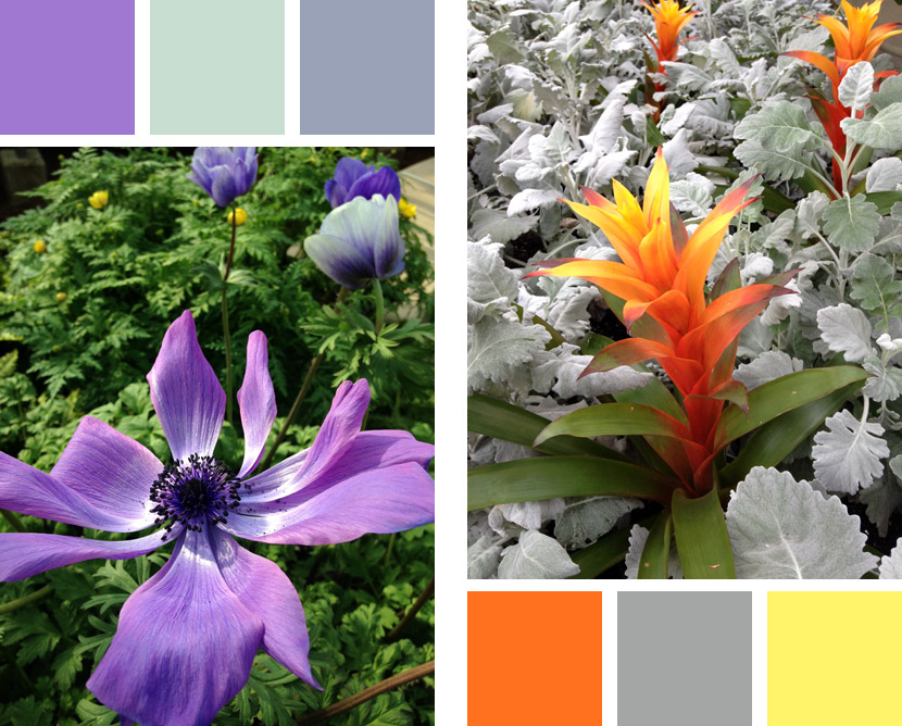
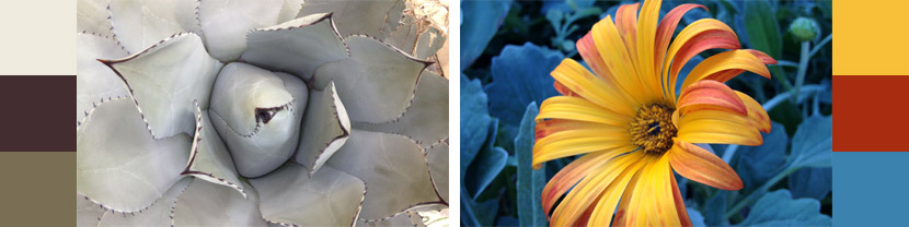
Let’s quickly break this down. Despite the large variety of plant life, Longwood Gardens is all about the flowers—and flowers are all about color. And when it comes to the elements of design, color has to be the most fun of the bunch. However I’ve found myself struggling with color from day one. Selecting a strong color palette is not as simple as you think. It simply does not come naturally for me. So if it’s not in your nature—look to God’s nature.
This exercise is very simple. Take a photo, open it in Photoshop, then sample the main colors using the eyedropper tool. While it’s really that simple, allow me to offer a few tips and notes about strategies you can use:
- Do you know the eyedropper tool has settings? The default is “Point Sample.” That means that it will give you the color of the one single pixel your mouse clicks on. That’s not very helpful when you’re trying to select the general color of a region as a color block can be comprised of pixels that vary greatly from the overall feel of the region. I usually change this setting to “5 by 5 Average” though you can go high as 101 by 101.
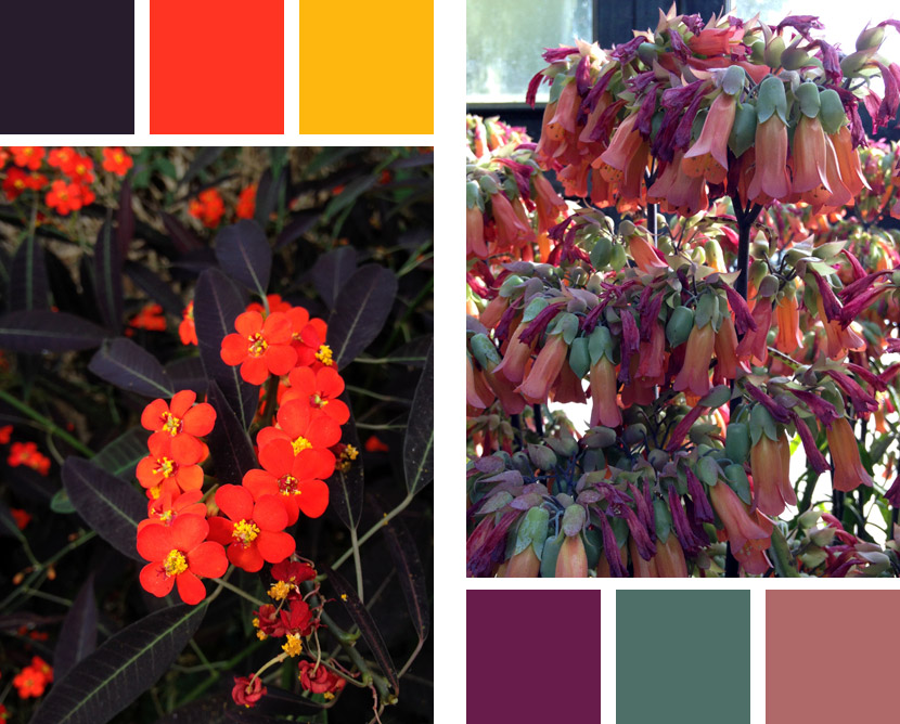
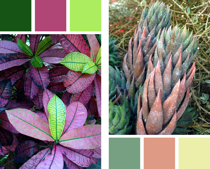
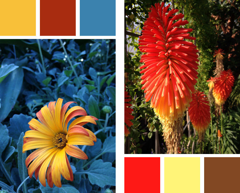
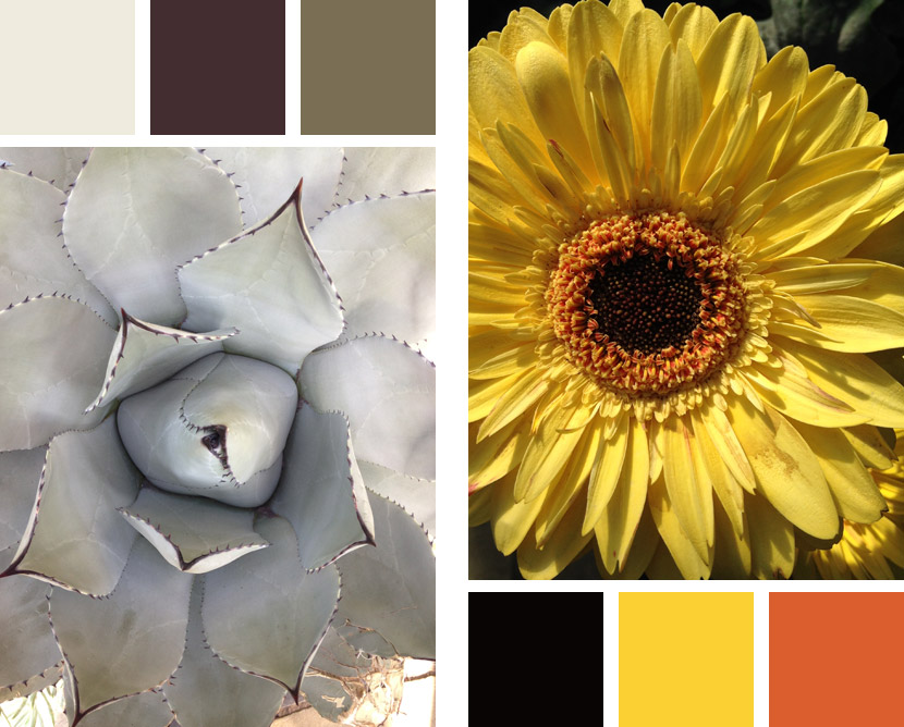
- Consider your approach. Are you going to focus on only the main subject of the photo, or are you going to take the entire scene into account? There is no right or wrong way. On most of my samples below I focused on a single plant. But on a couple, the surrounding florae were so complementary, that I sampled from them as well.
- Be aware of harsher shadows and highlights. If you’re trying to get a feel for a specific element, sample areas that have good lighting.
- This exercise works better with illustrations over logos and corporate work, but it can be used for most any design task. It can at least point you in some new directions worth considering.
Below I’ve included some samples using photos I took at Longwood Gardens (your palette may include more than three colors). And despite the fact that you’re “stealing” these colors from nature, you’re still using your own design sensibility to make the selections. If twenty designers chose colors from the same photo, they would all be different. Your choices are greatly affected by the project you’re working on. Are you looking for high-contrast colors? Do you want a softer, pastel-type feel? Do you need something bright that pops? Does there need to be a neutral involved?
It’s easy to get in a rut when it comes to color. Using Photoshop’s color selection tools can feel very sterile and downright depressing. God is the ultimate designer. Be inspired by His color palettes!