We love to overthink our logos. They’re very important, and they do deserve a lot of thought. But we like results. We feel like the amount of thought and time we put into something needs to be apparent when looking at the final product. It’s a trap! Overthinking in itself is not bad. The problem is when it leads to trying too hard.
Don’t be deceived. Creative simplicity is difficult. It takes work to come up with something straightforward and clean that’s unique, identifiable, and able to stand up over time as a representative mark for a company. That single concept can be elusive, but when you find it, you’ve found gold. It’s about creating a brand—not outlining a business strategy. As designers, we know in our hearts that simple is good. But our heads still tell us that our design would be more impressive if we “did a little more with it.”
So how do you know if you’re trying to hard? Quite often you’re trying to introduce multiple concepts into the logo. This goes hand in hand with the previous article in this series about the dangers of being literal. If coming up with one solid concept is difficult, would we say coming up with two concepts that work together is twice as difficult? That’s an understatement! You’re not only dealing with two concepts that need to stand up on their own—they also need to work with one another and make sense together. They need to interact. The difficulty is not additive—it’s exponential!
Oh, it’s possible to do. When you see a logo that introduces multiple concepts—and does it well—it’s impressive. But as this series is geared to the new designer and the non-designer who has been given the task of developing a logo, I’m standing behind you and pushing you away from trying to gel multiple concepts with all my might.
I should clarify what I’m referring to when I talk about “concepts.” Because, for example, wanting your logo to be bold, clean, and strong is a good thing. Those are multiple concepts that are worth aiming for. But those aren’t the types of concepts I’m talking about here. I’m referring to aspects of businesses, such as delivery, packaging, accounting, speed, food service, freshness, etc. Some of those examples are quite specific and others are very general. The more specific your concepts, the more difficult they will be to combine into a logo. As we look at some examples, you’ll find the vast majority of famous corporate logos express very general concepts:

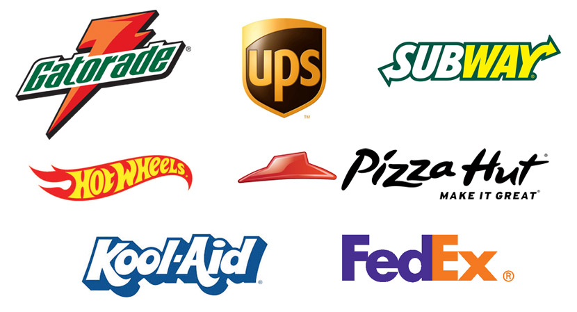
- Subway: Speed (in and out)
- Hot Wheels: Excitement
- FedEx and UPS: Direction (note the hidden arrow for FedEx)
- Pizza Hut: Location (via their iconic roof)
- Gatorade: Energy
- Kool-Aid: Fun
Trying to find well-known, quality logos that successfully introduce two concepts was much harder than I thought. If you know of a good example, please share it via the comments. I came up with one. Oh, it’s definitely well known. Is it quality? Well, I’ll leave that decision with you…


