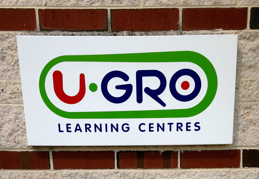
It’s a logo that shouldn’t work.
I spent the past week visiting each of the U-Gro Learning Centres, from Harrisburg to York to Lancaster, and everywhere in between. At each location I provided an hour-long presentation for the kids. There was some juggling, a bit of science, and a lot of clowning around. And everywhere I went, I was faced with this logo.

I couldn’t help but analyze it. The font weights between characters vary. There are tapered weights within individual characters, sometimes limited to just portions of the character. There’s a border of varied thickness surrounding the primary name. There are bright colors—and dots. It’s chaotic. Or is it?
This is a deceptively difficult logo to pull off. Using the characteristics listed above, you can easily end up with something labeled as “fun.” But making it cohesive and balanced at the same time took a skilled mind. So once again, I’m going to tap into the spirit of this blog and overthink this design. What makes this “chaotic” logo work?
1. The left and right sides are balanced. Notice the thickness of the green container’s right side. It’s significantly thicker than anything else in the logo. And considering the tightness of the GRO letters which are also on the right side, why does this not feel right-heavy? We can thank the letter U. It has a thick left-hand side—significantly thicker than any other character’s weight. It’s also the only letter to have tapered thickness along its entire length. That taper creates a bit of action and throws even more visual weight to the left side. Plus it correlates with the shape of the green container so that not only is there a visual balance of weight, but a visual balance of style.
2. The G and the R use restraint. It would have been tempting to also make these letters tapered along their entire lengths, but instead the tapers were limited to the extenders. This keeps the design from getting too loose and too freeform, while still keeping a visual connection with the U and the container. Note also how the shape of the R is exaggerated to reflect the shape of the U and the green container. Similarly, though it may not have been planned, the fact that the G is based off of the O shape brings a visual connection to those two letters.
3. The dots tie it all together. I feel the dots are mainly a way of connecting the colors. Without them, the green container would be the only green element. And the U would be the only red element. Given that, their roles are crucial. The green dot is also essential for balancing the weight. (However if the U was blue, I feel the dot in the O would be unneeded.) Finally, the fact that the stopping point of the G’s extender is the exact middle of the G is no coincidence as it again creates a visual balance with the O and its dot.
Apart from the visual nuances, using the three primary colors of light creates a playful yet solid feel—perfect for a daycare, as it says fun and educational at the same time. Sadly, I don’t know who created this logo, but my hat is off to them.


