Some of the liberties we’re allowed in logo design stem from the fact that we’re including the company name along with the imagery. The big boys like Nike and Apple can get away with just an icon. Your local heating and cooling business can’t. Neither can most of the businesses you’ll be working with.
And this brings us right to the main point. The text portion of your logo is just as important as the image. Even more, the text is part of the image. The two are inseparable. If you spend days developing a well-designed, clean, attractive, appropriate mark as your logo and then slap the company name below it as a last thought, you’ve totally ignored the most important design element. The company name is the anchor of the logo. Designers have various methods, but if you’re just getting started in logo design I encourage you to begin with the company name as a base and work off of it as you develop any imagery.
Where can I get fonts for my logo?
You may expect I’m going to tell you to get cheap or free fonts via the internet. And you’re right. That being said, there are some amazing type foundries out there that create and offer ultra professional fonts. If you have the means to support them by purchasing their fonts, by all means please do so. But if you’re just getting started with logo design and don’t know a lot about fonts, don’t spend hundreds of dollars on something you have little experience with. I’m NOT telling you to illegally download fonts. If a font is too expensive for your budget, move on. The last person who should be ripping off a designer is another designer.
The font resources available online are seemingly endless, so I won’t mention too many. I usually use myfonts.com as their search tool is easy to use and they allow on-site test runs with any font. I’ve also been utilizing Google Fonts more and more. Their fonts are geared toward use in websites, but all of the fonts they list can be downloaded as well.
What fonts should I use for my logo?
Here are some general thoughts about type styles.
SERIF FONTS: Serif fonts feel established and trustworthy. They also feel personal, or at least personable. They’re not pretentious or loud. Lawyers always use them.
SANS SERIF FONTS: Sans-serif fonts provide a more modern feel. They’re flexible and easy to customize. They can look good in both bold and thin styles. Tech companies always use them.
SCRIPT FONTS: Proceed with caution when using script fonts in a logo. They are often difficult to read, especially at smaller sizes. Script fonts give the feeling of style and class. Only use quality script fonts. Look carefully at how the letters connect. Does the tail of the letter match up with the following letter? This is a big issue and it’s one reason why you should rarely increase the kerning (add space between letters) with script fonts.
DISPLAY FONTS: Display fonts are created for use at larger sizes, like headlines. They’re not meant to be used for a paragraph of copy. So they’re often great for logos! They can be very creative, and that’s a reason for caution. If your logo makes use of an image and a display font, you can end up with two competing elements—especially if the display font is on the eccentric side. Many times it won’t match the style of the image. When getting started in logo design, stick with somewhat conservative display fonts, making sure they’re readable and appropriate.
How do I make my logo text look good?
This question pierces to the heart of design and answering it is truly beyond the scope of any blog post. This is where you’ll need to balance visual creativity and clear communication. Do a Google image search for logos. Find ones you’re drawn to and evaluate what it is that makes them successful. Consider the size at which your logo will be used. If it appears on a business card, will the type still be readable? Restrict the number of fonts you use. It’s rarely a good idea to use more than two typefaces—one for the company name and one for the tagline.
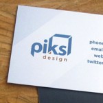
It is absolutely acceptable to have your logo consist of only text. You don’t need an image. Just be aware that if you’re using a cheap (or free) popular font, your logo will not have a very unique identity. Many other people are using that same cheap font. If you’re comfortable with illustration programs like Adobe Illustrator, consider tweaking the text shape (by converting it to outlines) in order to make it your own.
Fonts are fun! Font resources are readily available and more affordable today than ever before. They are powerful visual tools that need to be used responsibly, and they’re the key to making a great logo. Be fontastic!